To evaluate my project I looked at a number of options, eventually I settled on producing my evaluation in Prezi (an online presentation site) below is the link to the final presentation, enjoy and thank you for reading through my AS Media Coursework.
Monday, 25 April 2011
Monday, 4 April 2011
Double Page Spred Development
In this post, I am going to walk through thte stages of how I created my DPS
(Double Page Spread);
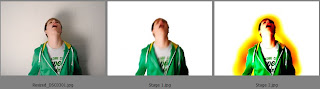
To begin with I decided that I was going to use one image as the background for my page, however the image I have chosen has an extremely bland and boring background so I made the decision to remove the background and replace it with a white fill. for the second stage I duplicated the image and placed it above the first, I then went back to the first image and placed a movement blur onto it so as to distort the image. When setting the blending layer of the duplicated image to linear light I was pleasently surprised by the result and therefore decided to keep it. To add some interest in the image I placed a series of colour around it, I liked the idea of a fiery theme so I stuck with the reds and orange in order to achieve this.

To add even more interest in the image, instead of keeping just a plain 2 tone colour around the image I used to liquify tool in Photoshop to blend the colours together and create what seems to be flmaes actually emerging from the background, I thought that this added in a more dynamic overall view to the image. The next stage was to start creating the page itself, I began by placing the header for the page in a black box at the top of it, this was to keep the magazines theme consistent and the contrast between the black and white really set of the image, I also added in the date of the magazine issue and the web address of the magazine as well, these are both fitted in above the page header.
Final DPS:

This is the final DPS, i have added in an interview to the pages so that it runs together, to start it off I used the 'W' in a larger font and a diffrerent cover so that it draws attention and people want to read the article, the way I set about laying the interview out was to have the interviewers questions in a different colour to the answers, I felt that this was an importanat factor as it allowed a clear separartion from the 2 and meant it wasnt going to get confusing for the reader. Before the interview starts I decided that it would be a better idea to put in a couple of paragraphs giving a bit of history and background information from which the questions in teh article would arise from and this again allowed the continuity to flow over the 2 pages.
Once I had finished writing up the article I decided to add an incentive to the readers which may also have caught their eye, on the right hand side at the bottom I added in a black box and put details about free merchandise, in this case 3 free songs from the artists album, as this was to help create an interest and would be a USP for my magazine. After going over the page quickly to check it I noticed I didn't have a page number, so I flicked through a couple of magazines that I had laying around and saw that not all of them had a page number on each page, therefore I've decided to only number one page of the DPS.
Monday, 14 March 2011
Front Cover Development
After getting some feedback on my initial cover, I set to work on making a few alterations so that it looked more like a front cover that you would most likely see in shops and on the magazine stands, the steps I took will once again be posted and given a detailed explanation below:

The majority of the feedback was that my cover lacked any differentiation between the colour scheme. The first step I took was to move the CDI over to the right hand side a bit more, allowing me to have more room to work with for my features. I also took the strapline and made it smaller, changed the colour to a golden shade as I thought it would compliment the black background of the cover. The masthead has also been increased in size so that it draws more attention tot it when on the shelves. In the second phase I kept the majority of the text the same, however I did play around with text sizing so that certain aspects would be clearer, predominantly these were the key articles that would feature in the magazine itself, these were also highlighted with block colouring which helps enhance the overall look of the cover as well, by having more colours in the scheme it also added another dimension to the cover. The features have also been changed into colours as well so that it isn't just one single colour throughout. The third stage of this development is where I took the coverline and added it back in, again i changed the size of it and matched the colour to the strapline, I have still kept it with the strapline so as to keep a continuity aspect there. I also added the barcode and the other small bits of information, such as price, issue number and date back in, these werent changed as I felt that they were suited to where they were and weren't in need of being change.

In these next two development sections I focused on getting all the fienr details in place and ordered correctly . The first stage here I went and took out the page numbers that were with the features on the left hand side and simply had the feature, I also changed the features so that they all had the same colour, however so as not to end up with another cover that had a very single coloured scheme I then broke the featuers up using some red lines that gave it a more flashy look so to speak. In the second stage here I then moved the CDI to the right and up a bit as I felt that by moving the features covered up some of the image and I wanted to keep the entire image viewable. The main article title was then added back in and placed back into its original position so that people knew who the artist on the cover was. To make it a more authentic looking magazine cover page I have added a web page to it so that people could go online and access extra material on the magazine.
Final development of cover:

This is where the development of my cover has gone, I have used the feedback from people and through research as well, I feel that this is a much better overall look for a magazine cover. To this final one I have added back in the puffs along the bottom of the cover, and once again used the block colouring to enhance the overall aesthetics of it.
Looking back at the original cover I had, I believe that this is a much more appealing cover to my target market, it has that edgier look to it and a more current feel and look. I personally feel that overall this cover has taken into account the feedback and the criticisms that I have been given and I hope that this cover meets my target audiences needs.
Sunday, 13 March 2011
Creating my magazine contents page
In this post I am going to once again take you through the stages that I undertook in creating my magazines contents page:

To start with I began by taking a white page and continuing my theme from the front cover went for a large piece of text boxed in with colour, allowing me to use a white font here on a black background. The image in the upper right hand corner of the page was created by taking the original image, duplicating it and applying a zoom motion blur to the bottom layer before changing the top layer to a lighten layer, this gave a distorted yet unique image. I've also added in some text under the image giving it a reference to a DPS in the magazine. In the second and third phases of this design I added in another image, this time I simply changed the brightness and the contrast of the original before flipping it horizontally in order to make it seem as if the subject is looking into the details on the page. Once again I added in some text which linked the new image to content on the cover.

These next two phases are where the pages really start to take shape, in the first of these stages I have added some block colour and some more text to the bottom image and started to add in some more page details about the content in the magazine itself. On one of these articles I added in I have linked it to a recently released song which has become quite popular called 'I Need A Doctor' which was released by Dr Dre. therefore I added it to the contents page in the line 'Dre needs a doctor' playing on the name of the song. In the second of these shots, I decided that the page was looking a bit bland and boring so I decided to once again carry my them from the front cover and break up the lines of text with some simple coloured lines. I've also added in a small piece of text with a link to the website where there are extra reviews, competitions and downloads as well.
Final Contents Page:

This is the final contents page that I have come up with, the additions on this one are that I have taken up the large empty space on the right hand side of the page with text that gives the readers a much more detailed view, although not too detailed that they get the information straight away, into what the rest of the magazine will cover inside. By using some more block colouring it draws the eye to it and make people want to read it. I have also used text at the end of the piece which gets larger to indicate that the magazine only gets better and better as you are reading it and that there's a lot more inside on top of what's being advertised on the contents page itself.
Sunday, 6 March 2011
Creating my magazine front cover
In this post I will take you through the stages that I went through to create my cover:
(All the fonts which have been used were found online at www.refont.com)

Above you can see the first 5 stages that I took to create the cover, I started by taking the original image and changing the brightness and contrast to give a darker, Richer image. The next step was influenced by a cover I had seen this year of Kanye West with a crown of thorns on his head, so I decided that I wanted to create my own powerful image. I took a stock picture of a skull I found on the internet and pasted into Photoshop on a new layer, I then changed the size of the image several times until I was happy that it was the right size and in proportion to my original image. Next I used a feature in Photoshop called warp to change the angle of the skull so the contours all lined up and it matched the shape of the subjects face, I tried to make the cheeks, eyes, chin and nose match up so that it looks like it could actually be his skull, I also trimmed off the upper part of the skull as it was too big to be on the image.

In this next phase of editing, the cover itself starts to come together, after having the skull image lined up with my photo I changed the layering effect on Photoshop to an overlay so that the skull was a lot more transparent and it also blended with the colour of the face. To then change the image and give it yet another dimension I selected the facial area of the image and cut it out, putting it onto a new layer, I then filled the gap and made the entire base layer black, with the facial image pasted back onto a new layer I lowered the opacity of it to 86% to create a bit more of an edge to the image. I then set about making it into a cover, I started by putting the title on, looking at the cover I didn't think that my previous ideas had the suitability for the cover based on the image I now have, I then placed my strapline on 'They said Hip-Hop was dead' I chose this as a strapline because of the suitability and the relation to my main image. I also placed on the price, date and issue number in the bottom corner. The next stage that I went through was placing on the name of the artist on the cover, I placed it down in the bottom left as I felt that it was the most appropriate place and it also filled a large blank area.

These are the final stages of my cover coming together, in the first of these I added a barcode to the bottom right of the cover and then moved the date, price and issue number above it to keep all of the magazine details together. On the next step I added a puff underneath the strapline giving a bit more detail about the main topic of this magazine, as the cover has the image with the skull being superimposed and the strapline being to do with Hip-Hop being dead, I put the puff to read 'We meet the man who is leading the ressurection' I felt that it was suitable as it fitted with the whole genre of this particular cover. In the final cover I added some more puffs to the bottom to fill the blank space and to add extra information about the magazine for the readers, I also moved the price etc to the right a little bit as there was a gap that I felt shouldn't have been there.
FINAL COVER:
For the final cover, I added in some more puffs down the left hand side of it to again show what else the magazine has inside of it, I have put that it has interviews with several major artists who have just released new songs out onto the market which would entice people to read the magazine hoping that they would get an idea of what the new songs are like, I have also put the competition there, this will also make people want to read the magazine because gig tickets are highly sought after and being the first issue the tickets will help to bring in customers which could then be turned into a loyal customer base. I have had to move down the 'Van Kho' text though as when I was adding in these puffs they overlapped into the text so I have changed the text size and slightly altered the layout to create the final version of my magazine cover.

Magazine Coursework Images
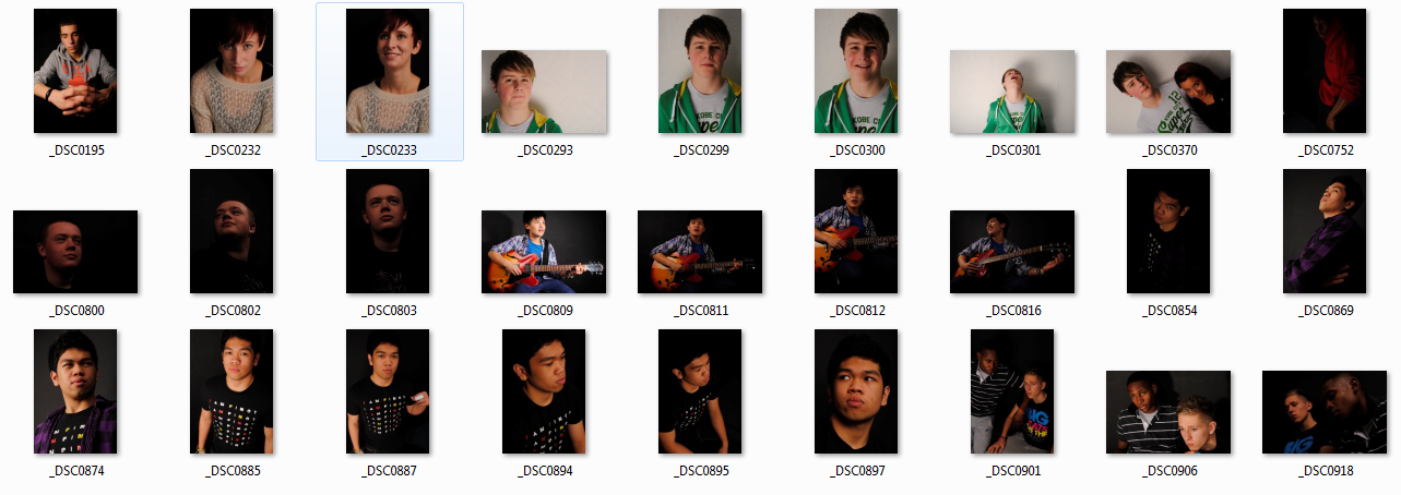 These are the images that I have taken and chosen to use for my magazine cover, contents and also the DPS that I will be creating over the next month or so, the images which have been taken have all been thought about so as to portray the messages that my magazine will have when its all been finished.
When it came to taking the images myself, I decided that I would use my strengths in photography to utilise the schools studio space in which I felt I could create some stronger images because I had control over the lighting whereas taking the images outside meant that I would've been quite dependent on the weather being right.
Monday, 7 February 2011
 This is my first attempt at making a contents page for my prelim magazine task. I have tried to incorporate the colours and ideas that I had on my prelim cover idea, the cover also had a series of articles on it and therefore I've made sure to carry them through onto my contents page so that it had some continuity about it.
Friday, 28 January 2011
NOW Magazine Contents Page
Now Magazine
This magazine grabs you straightaway with its vibrant, vivid and almost completely clashing colour scheme, and when you open the contents page you see the trend continues, the bright pinks, the vibrant blues the yellows, all look as if they shouldn’t be there, all clashing against one another, but that’s what sets this magazine apart from its competitors, its unique look and feel.
On a first look you see that the main focus of this contents page is linked to the story on the front, you’re bombarded by pictures of the magazine saying that they’ve known it was coming and they even have a mini article on their contents page which links all of this together. You have a competition at the bottom of the page and the contents of the entire magazine running down the right hand side of the page, almost like they’ve been tucked away from the reader, the only thing drawing attention to them being a series of colour boxes that add a flash of colour to the page.
As far as images for this contents page go, they are only the covers of past issues that the magazine have done really, there’s on for the competition and one of the columnist but apart from that there are 4 small thumbnails of previous covers, so all in all not a very exciting contents page, it seems as if the page is an article with he contents pushed to one side.
FHM Bionic Contents Page
FHM Bionic
This issue of FHM that I bought is split into two magazines, FHM and FHM Bionic; I have chosen to look at the contents page from FHM Bionic. At a first look it’s quite a clean cut, well presented page, simplistic colours have created a very casual yet efficient looking scheme to the reader. It’s appealing to look at, the orange giving clear indication to the page numbers is a bold contrast from the crisp white background of this page, the black lettering also helps it stand out and become even more enticing than it already appears to be. The pictures that are being used on it are also sticking with the colour scheme and overall look of the magazine, the main image is an extremely strong one, it’s the crisp white tank top, the cut over his eye and the post production editing tweaks that create a strong imposing image, that straightaway draws you to want to read the article its advertising to you.
The other images that have been placed into this contents page fit in with the point of the magazine as its advertised, they are directly linked to the articles about which they represent, they are in keeping with the bold vibrant look and feel of this issue, the colour scheme is again dominant in all but one of the images, which I feel gives it a very strong overall feel to the magazine.
Thursday, 6 January 2011

These are my 2 ideas for my own masthead for my magazine, i feel that they are both very current and at the same time they are also very different from one another, the top one seems to be a little bit more of a clubbing scene, electric, trance and dance style. Whereas the bottom one to me is more modern and simplistic, the font and the background graphic seems to me that it just fits together better and looks a lot more like a masthead than the top one, these are however only preliminary designs and I have no doubt that I will be developing it further as I design my

magazine.
Q and Mixmag Masthead Analysis
Q:
The masthead for Q is possibly the simplest one around, its simplicity is what makes it the recognisable icon that it is, the colours are simple, yet they are contrasting to make it stand out on the shelf.
The way this masthead has been put together would suggest to me that it is aimed at a higher end of the market, with the readers probably from the 26-40 age range, its almost a modernistic type of masthead which implies that the readers have a taste in the modern but they also like the older things, they like to be able to reflect on their past.
Mixmag:
This masthead is one that says to me, younger market, current market and a market that wants to be kept up to date with everything now. It looks ‘techy’ which to me means that the audience that its aimed at like their gadgets and i would hazard a guess that there would be a section on gadgets inside this magazine.
Q Contents and Double Page Spread


Contents:
The contents page in Q is completely different to the one that is in Mixmag, this has a more upmarket look and feel to it, but then again the market for Q is a more upmarket audience. The house style of Q also helps to reflect this, the colours are kept to simple reds, black and white, these 3 colours help with giving it a distinctive feel and look.
The contents page immediately displays all of these house colours and the house style, simple fonts, the 3 colours it is all there. The first page of the contents has 2 images on it as well as an image of the front cover of this issue, the larger of the 2 images on the first page is shown to be about an article as it has a page number on it and the contents show that its to do with the Manic Street Preachers, on the other hand the other image doesn’t seem to have any specific relevance to the contents page but from the title of this issue i thinks its a band that have an album in Q’s top 250.
The image of the Manic Street Preachers has been taken where i believe to be china town has been given a retro look to it, the clothes, the way the photo has been edited in post production, it all makes it look likes it got a new take on an old concept.
The second page on the other hand has a lot more images on it but they are still following the same type of style as the CDI on the first page, a slightly retro look and feel, and again the house style has been applied to the layout and the colour scheme in the overall look of the page, the layout of these 2 contents pages has again been broken down into subsections so that readers can find the articles that they want to find.
Double Page Spread:
The DPS that i have chosen from Q is one on George Michaels new album ‘Faith’ which is going to be released on the 31st January 2011, straight away your eye is drawn to the article by the oversized P that starts it off, its easily 7 or 8 times the size of the rest of the text and so stands out from the rest of the page, the other side of this DPS is an image of George himself, which I’m assuming is the cover of the new release, in my opinion this image is keeping with the way that he is already perceived, retro looking, slightly camp, yet a strong masculine image.
As its a review there is a rating of what the magazine think of the new release, they also have a small strapline about it, on the left hand side of the DPS they have a section which is saying if you like this then try this and its a series of other artists and their music that they would recommend to their readers. This is a good feature as it engages the reader and may help them to explore thei own music horizons and find something that they might like.
There is a quote from the article in the middle of the first page of the DPS, its in a larger font, a bordered box and a different colour, the quote itself makes you want to read the article as it makes the review sound like it has more to offer to the reader.
I like the way that this DPS has been done because it engages the reader, it offeres advice and an honest opinion of the album, the way the quote is in the middle enticing the reader in as well, it all offers different ways that you can make your audience feel like they have an influence on the magazine.

Mixmag Contents and Double Page Spread


Contents:
Mixmag’s house style from looking through the magazine is one which uses a lot of bold vibrant colours, it also uses a lot of contrast in the magazine to make it easier to read and draw attention to it.
Looking at the contents page, straight away it’s clear that the house style has been applied here, the pages are high contrast, black backgrounds with white and yellow text, making it very distinguishable when its being read. The first contents page has 2 images on it, there’s a larger main CDI and then a smaller one which is directly linked into an article, the main image is a very stereotypical clubbing image, the scene, the way the lights have blended into the image and what appears to be random lights in the image suggest to me its been taken in the middle of a busy club and the camera has captured part of a light set as its going off, the subject of the image is probably who Mixmag would consider to be their target audience member.
On the second contents page, again there’s the CDI and this time there are 2 smaller images at the bottom of the page. The CDI on this page is related to an article on fashion and i would consider this image to be a high level fashion shoot, they mise-en-scene of this image has been thought through and has the reflection of the clubbing scene showing through in it, the 2 smaller images are both being linked to articles on the artists that the images are of, one of them being a photo is a lot more personal, but the other is a cartoon sketch which would suggest the band or artist seem to be a lot more relaxed about their image and are comfortable with it being their own unique style.
From looking at the contents layout it would seem to me that the magazine is being presented in sections, and the contents page clearly has these sections being displayed with titles above them and each title having the page number and a brief description of the article beneath them, the fonts are bolder here to make it stand out from the rest of the text on the page and therefore making it easier for the reader to see what the articles are about.
The only place that I would consider Mixmag to have used their logo is on the first page of the contents in the top left hand corner, which is the use of the magazine title, however it’s not that big so therefore it even took me a while to realise that it was there.
Double Page Spread:
The DPS that i have chosen to do is a Q+A with ‘one of the UK’s premier live acts’ Groove Armada, the Q+A is on why they’ve decided to stop touring.
The title of this piece is a large bold font, with simple block lettering, the title itself is predominantly black with Groove Armada written in pink to make instantly recognisable who the article is about, the contrasting in the colours of the title also help to draw attention to it.
The layout of this DPS is that one page is all the text and the other is 1 image of the subject of who the article is focused on, the first page in this instance is of the text, in this case the questions being answered, on the other page is an image of the boys which has been set out with the magazines house colours, the bold vibrant pink as the background and the contrast being set out by darkness of the clothes that they are wearing is also helped by the lighting that has been used on the shoot has highlighted parts of the subject creating a more dynamic image.
As they are possibly the biggest live act in the UK DJ scene the fact they are stopping their tours is what is going to draw people in to read this article, they have a large fan base and this is major news to them. After reading the article myself it becomes apparent that they aren’t quitting music all together but they are going into the club scene to play live sets.
I like the way that this DPS has come together, i think it shows that having large blocks of text can still be interesting and doesn’t have to just be boring, the fact it has been done as a Q+A makes it a lot easier to read, it gives the article a much more personal feel to it, it engages with the reader on a different level and that’s why it is a good article in my eyes and that’s why i like it.

Subscribe to:
Comments (Atom)