To evaluate my project I looked at a number of options, eventually I settled on producing my evaluation in Prezi (an online presentation site) below is the link to the final presentation, enjoy and thank you for reading through my AS Media Coursework.
Monday, 25 April 2011
Monday, 4 April 2011
Double Page Spred Development
In this post, I am going to walk through thte stages of how I created my DPS
(Double Page Spread);
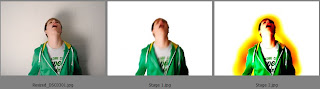
To begin with I decided that I was going to use one image as the background for my page, however the image I have chosen has an extremely bland and boring background so I made the decision to remove the background and replace it with a white fill. for the second stage I duplicated the image and placed it above the first, I then went back to the first image and placed a movement blur onto it so as to distort the image. When setting the blending layer of the duplicated image to linear light I was pleasently surprised by the result and therefore decided to keep it. To add some interest in the image I placed a series of colour around it, I liked the idea of a fiery theme so I stuck with the reds and orange in order to achieve this.

To add even more interest in the image, instead of keeping just a plain 2 tone colour around the image I used to liquify tool in Photoshop to blend the colours together and create what seems to be flmaes actually emerging from the background, I thought that this added in a more dynamic overall view to the image. The next stage was to start creating the page itself, I began by placing the header for the page in a black box at the top of it, this was to keep the magazines theme consistent and the contrast between the black and white really set of the image, I also added in the date of the magazine issue and the web address of the magazine as well, these are both fitted in above the page header.
Final DPS:

This is the final DPS, i have added in an interview to the pages so that it runs together, to start it off I used the 'W' in a larger font and a diffrerent cover so that it draws attention and people want to read the article, the way I set about laying the interview out was to have the interviewers questions in a different colour to the answers, I felt that this was an importanat factor as it allowed a clear separartion from the 2 and meant it wasnt going to get confusing for the reader. Before the interview starts I decided that it would be a better idea to put in a couple of paragraphs giving a bit of history and background information from which the questions in teh article would arise from and this again allowed the continuity to flow over the 2 pages.
Once I had finished writing up the article I decided to add an incentive to the readers which may also have caught their eye, on the right hand side at the bottom I added in a black box and put details about free merchandise, in this case 3 free songs from the artists album, as this was to help create an interest and would be a USP for my magazine. After going over the page quickly to check it I noticed I didn't have a page number, so I flicked through a couple of magazines that I had laying around and saw that not all of them had a page number on each page, therefore I've decided to only number one page of the DPS.
Subscribe to:
Comments (Atom)